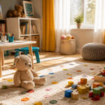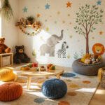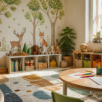
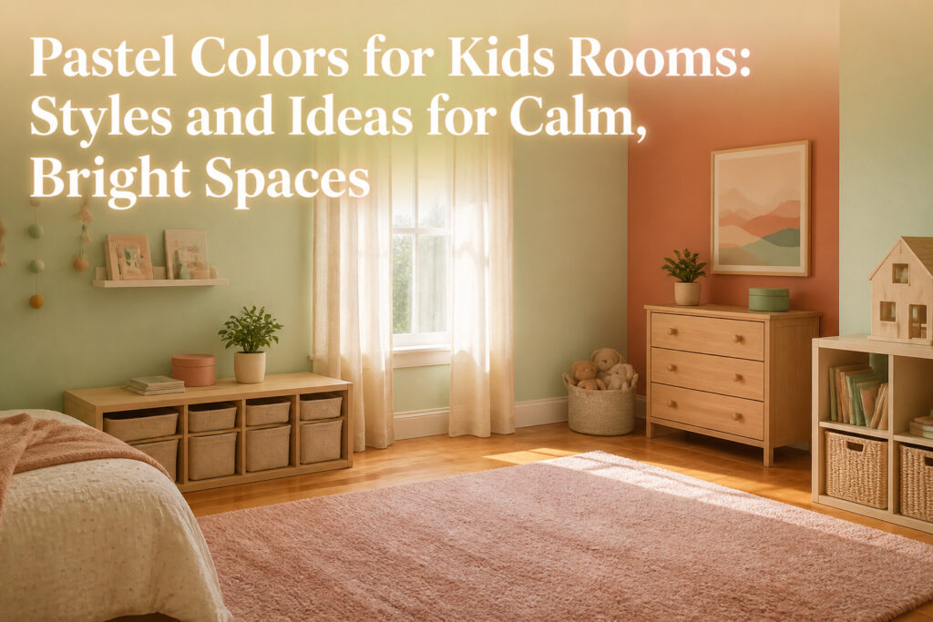
A pastel colors kids room uses pale, muted shades to create a calm, bright space that adapts as children grow. The challenge is keeping the palette from tipping into nursery territory or washing out completely.
One approach that works: creamy mint on three walls with sun-bleached terracotta as a single accent, then rose beige through textiles rather than paint.
[link-whisper-related-posts]Summer Pastels for Kids’ Bedrooms

A summer pastel palette mixes just enough white into each hue to keep it pale while the original color still shows through.
We have seen creamy mints, rose beiges, sun-bleached terracottas, and the palest primroses work as the backbone of a child’s bedroom because they read as color without shouting it.
Keep all four in the same tonal family so nothing jumps out. Creamy mint and pale primrose both carry that soft yellow undertone; rose beige and sun-bleached terracotta share a muted warmth.
Pair them and the room holds together without looking matched.
These shades suit children’s spaces for practical reasons.
Light colors bounce daylight around a room that might only get morning sun, and the muted quality means handprints and the odd crayon mark do not announce themselves the way they would on saturated walls.
We would not use these pastels in a playroom where the energy needs to stay high, but for a bedroom they slow the eye down at bedtime.
One approach that has worked for us: put the terracotta on one accent wall, keep the other three in creamy mint, and bring in rose beige through textiles.
The primrose works best in small doses, a lampshade or a storage bin, so it does not tip into nursery territory.
Clean Pastels in a White Room

A cool white bedroom gives pastels room to breathe without turning the space into a candy box.
We like keeping the walls blank and letting the accessories carry the color story: a geometric blush rug on the floor, a dash of summer yellow and aqua in wall art hung where morning light hits it, soft mink and pink in bedding or a throw.
The furniture stays sleek and modern, almost invisible, so the eye lands on those small color moments instead of a single overwhelming hue.
Restraint matters here. One pastel per zone keeps the room from feeling scattered; repeat that tone in two places minimum so it reads intentional.
A wooden bubble gum machine on a shelf, a monogram wall hook in matching floral, a storage case that picks up the same shade: these are the touches that make a white room feel finished rather than bare.
Two accessories in the same pastel, placed where the child actually sees them, beats five random colors scattered around the room.
Tropical Rainbows

Tropical pastels borrow from the same rainbow logic as a standard pastel kids room, but they push the warmth up a notch.
Where a typical scheme might stop at baby pink and powder blue, this one pulls in peachy petal pinks, coral, and a shot of aqua or mint green that reads more Caribbean than nursery.
The result still reads calm, but it carries the energy of a space that gets actual daylight and heat.
We have seen this go wrong when every wall gets the saturated treatment. Keep the architecture clean, white, or grounded with natural flooring, then let the textiles do the color work.
A floral bedspread or a pastel rainbow wall piece becomes the focal point instead of the room screaming back at you.
For a weekend project on a few hundred dollars, paint is not your only move. Swap in sandy bed sheets, add a tonal throw, and bring in one piece with a hint of neon if the room still feels flat.
The neon is a risk, but a small one, a light sprinkling in a single lamp or cushion, not a feature wall.
If you are renting, removable wall art in a tropical pastel palette gives you the vacation vibe without the landlord conversation.
Neon Pastels

A single neon accent against a pastel field wakes a room up without turning it into a play zone.
We have seen a hot coral lamp on a pale aqua wall pull the eye exactly where you want it, the way a beach hut door catches sunlight against faded siding.
The same rule holds for neon lime against mint green, or a tangerine throw on a blush pink bed. One source pairs peach accents with lemon and pale grey; another sets neon orange against sun-bleached terracotta.
Both work because the pastel does the calming and the neon does the pointing, and the ratio stays roughly one to ten.
If your child already has a rainbow mural or a mud kitchen in the corner, skip the neon entirely. The room has enough punctuation.
But in a space that reads flat, one neon bracket on a pastel shelf is the cheapest move we know to fix it.
Cozy and Calm Palettes

Pastel shades that soothe a child and give a sense of security work best when they stay close to nature. Lavender and lilac carry enough coolness to settle an overactive mind without turning a bedroom cold.
We have seen these purples quiet a room that felt chaotic by mid-afternoon, especially when the light starts to fade and everything stills.
For children who run toward the anxious or clingy side of temperament, fawns and velvety vanilla ground the space in warmth. These are not beige by default.
A fawn with a hint of pink underneath reads as sheltering rather than blank, and velvety vanilla keeps walls from feeling institutional the way flat cream can.
The texture reference in the name matters: it cues you to add softness through fabric, not just paint.
The balance comes from pairing. Lavender on all four walls can feel like a confection.
We would put it on one wall behind the bed, let the others go vanilla, and bring fawn in through the rug or the curtain.
That leaves the child room to add their own color with toys and drawings, which they will, and the palette stays calm underneath.
Color Choice by Child Temperament

Cold light shades of purple, violet, or lilac settle restless kids and help them concentrate.
We have seen this work in rooms where a child bounces from toy to toy; the walls do some of the calming so you do not have to.
For children who are already calm, shades of orange and yellow add energy without pushing them into chaos. Think of it as a gentle nudge toward activity rather than a loud demand.
Kids prone to sudden mood swings or violent emotions do better with cool pastel blues, greens, or turquoise; these tones steady the room without feeling clinical. Plodding, creative personalities suit natural beiges, like fallen leaves or coffee with milk.
The rules are useful but not rigid. Mix in texture, watch the proportions, and choose what fits the child you actually have, not the one a chart describes.
Pastel Furniture

A single pastel piece in a kids room acts like a quiet anchor. We have seen a mint green dresser or a dusty rose bookshelf pull the whole space together without shouting for attention.
The color stays soft enough that toys and clutter do not fight it, and the piece still reads as intentional against white or beige walls.
Add a second or third pastel piece and the room shifts. Two matching nightstands in pale blue start a rhythm.
A bed frame, desk, and storage bin in the same tone can tip toward too much, though.
The balance we look for is one strong pastel piece, maybe two if they are small, with everything else in natural wood or clean white. Rattan or unfinished wood frames the color instead of competing with it.
One pastel piece calms the room; three or more need neutral spacing between them. We would skip the pastel bed frame if the dresser already carries the color, and we would never match wall color to furniture exactly.
The slight difference in tone is what keeps the room from feeling like a set.
Pink and Green Combinations

Pink and green together read as fresh rather than sweet, which keeps a kids room from feeling like a nursery left running too long. Mint green is the workhorse here.
It cools down a blush pink without making the wall feel clinical, and it pairs cleanly with wood furniture you probably already own. We have seen this combo go wrong when both colors fight at the same saturation.
The fix is simple: keep one color quieter than the other. A soft rose with a stronger mint works; a loud bubblegum against a pale mint looks like a candy wrapper.
For a renter, mint on an accent wall with pink in textiles is the safer half of the swap. Bedding and curtains move with you; painted walls do not.
If you are buying paint, test a patch near the window and another in the corner. Mint shifts dramatically with light, and the pink beside it will look different in each spot.
We have watched a mint read almost aqua at noon and gray by evening. That is not a flaw; it is the reason the pairing stays interesting.
Plan for the shift, not against it.
Functional Furniture in Pastel

A desk in a soft mint or pale blue does the color work without a single extra object on the surface.
We have seen too many rooms where the walls carry all the pastel and the furniture fights it; the result reads as clutter before the child even owns enough to clutter it.
Paint the desk and the storage unit the same tone, or one shade apart, and the room holds together while the pieces still do their jobs.
For storage, a low cubby in blush or butter yellow keeps toys reachable and adds warmth at the floor line where white walls go cold.
We would skip the pastel bookcase with ornate backing; it photographs well but the cutouts waste depth you need for actual picture books.
A simple painted frame with canvas bins in a slightly deeper tone of the same color hides the chaos and reinforces the scheme.
The mistake we have watched renters make is buying the pastel piece first and planning around it. Measure the wall, know what the space must store, then find the piece in the color.
A desk that fits with two inches to spare beats a perfect lavender one that blocks the closet door.
Textiles and Decorative Accessories

Textiles and decorative accessories let you test a pastel palette without picking up a paint roller.
We have seen rooms where a single blush rug or a set of pale blue cushions changed the whole mood, and the parents could pull them back out if the color did not land.
A geometric blush rug anchors the palette the same way a painted wall would, but it rolls up when tastes shift.
Wall art in soft mink, pink, or aqua works the same trick. Sources describe a white room where the blank walls and sleek furniture stayed put, and the pastel story came entirely from framed pieces and a few textile accents.
That approach costs less than replacing a bed or desk, and it moves with you if you rent.
Cushions and curtains in lemon yellow or pale green pastels layer onto neutral paint without commitment.
One source pairs a sunny yellow button-detail cushion with a gold spotty one against peachy petal bedding; the contrast keeps the room from going flat, and swapping the covers takes minutes.
Storage totes and baskets in matching pastels extend the color to functional pieces that still hide clutter.
The risk is overload. We would stop at two or three pastel elements in a small room and let the rest stay white or light gray.
A floral rug, floral bedding, floral wall hooks, and floral bunting in the same room fight each other even in soft tones. Pick one pattern, keep the rest solid, and the calm actually holds.
Why Pastel Colors Matter in a Child’s Room

Colors in a child’s room do more than fill space; they shape how a child sleeps, plays, and settles down.
We have watched enough room makeovers to notice the pattern: walls saturated in loud primaries leave kids wired at bedtime, while pastel walls let the energy come from the child, not the paint.
The softer the base, the more room there is for bright toys, drawings, and clothes to pop without overwhelming the space.
Pastels work because they carry color without the saturation that triggers overstimulation. A dusty rose or soft turquoise still reads as pink or blue to a child, but the muted quality keeps the nervous system from revving up.
Sources describe this as a balance between whimsy and calm, and we have found it holds up in practice: kids treat a pastel room as a place to both imagine and rest.
That dual use matters more than most parents expect, since a bedroom often serves as play space, study corner, and sleep zone all in one afternoon.
Versatility is what you get in return. A child who draws bright pictures or stacks neon blocks brings that energy with them; the room does not compete.
As they get older, the same soft walls shift easily toward a more grown-up look with new textiles rather than another paint job. Pastels age with the child instead of against them.
Pastels for Every Kid

Pastel shades work in any child’s room, full stop.
We have seen parents hesitate over a soft mint or a pale lavender for a boy’s space, or a powder blue for a girl’s, as if the color carries a gender it does not actually have.
The only question that matters is whether the shade feels calm and bright to the child who sleeps there.
Young kids often prefer bolder hues anyway, and pastels shift with them as they get older, becoming the peaceful background that still feels personal. If your son wants rose beige on his walls, that is the right choice.
If your daughter gravitates toward creamy mint or sun-bleached terracotta, those work just as well. Blue pastels can balance a boy’s room, purple accents can suit a girl’s, but those are starting points, not rules.
Green pastels drawn from nature function almost as neutrals now, and grayed-down pastels mix with anything. The mistake is letting the old pink-or-blue framework choose for you.
Ask the kid what they see, test a swatch on the wall for a day, and pick what gives them comfort.
Blue and Yellow Pairings

Blue and yellow sit together in a way that feels newer than the pink-and-green pairings you see everywhere right now.
Soft butter yellow with dusty sky blue reads as fresh rather than dated if you keep both colors muted, the same pairing that shows up in vintage children’s books.
Paint the ceiling in pale yellow and the walls in the blue, not the other way around; yellow overhead mimics daylight and keeps the room from feeling like a nursery rhyme.
For a weekend project, swap in yellow lamp shades on a blue base or re-cover a headboard in faded chambray against butter-cream bedding.
The risk is tipping into primary colors, so we test swatches side by side in the actual room light before buying.
If either color starts reading too saturated, add a third soft tone, barely-there gray or warm white, to knock the edge off.
This pairing works especially well in north-facing rooms where you need the yellow’s warmth to balance cool light.
How Pastels Shape Behavior

Cold light shades of purple, violet, or lilac settle the overactive child and pull attention toward tasks.
We have seen this work in rooms where a lavender wall or a lilac storage bin replaced a saturated primary color, and the shift was noticeable within a week.
Sunny shades of orange and yellow do the opposite, giving quiet, plodding kids a push toward activity without tipping into chaos. A pale terracotta or a sun-bleached tangerine on a desk or chair adds just enough warmth.
For children prone to sudden mood swings, cool pastels of blue, green, or turquoise act as a steadying hand.
These are not the deep versions that swallow light; the pale, washed versions keep a room airy while still doing the work.
Creative, methodical personalities respond to natural beiges, the color of fallen leaves or coffee with milk, which ground without distracting.
The proportion matters more than the shade itself. A full violet room can feel like a cave; the same color on a single rug or canopy does the job and leaves space to breathe.
We treat these color-temperament pairings as starting points, not prescriptions. The child who breaks every rule on the chart still deserves a room that feels like theirs.
Frequently Asked Questions
What are the best pastel colors for a child’s room?
Creamy mints, rose beiges, sun-bleached terracottas, and the palest primroses work best because they read as color without overwhelming the space. Lavender and lilac settle restless kids, while fawns and velvety vanilla ground anxious children in warmth.
The right choice depends on your child’s temperament and the room’s light.
Are pastel colors suitable for both boys and girls?
Yes. The only question that matters is whether the shade feels calm and bright to the child who sleeps there.
Green pastels drawn from nature function almost as neutrals now, and grayed-down pastels mix with anything. Ask the kid what they see rather than letting old pink-or-blue frameworks choose.
What is the best color for a kids’ room?
There is no single best color, but pastels beat saturated primaries for bedrooms because they let a child’s energy come from the child, not the paint.
Cold light purples settle overactive kids, sunny orange and yellow nudge quiet kids toward activity, and cool blues steady children prone to mood swings.
What are 5 pastel colors?
Five popular pastel colors for kids’ rooms are creamy mint, rose beige, sun-bleached terracotta, pale primrose, and dusty sky blue. Peachy petal pink, coral, aqua, lavender, and butter yellow also appear frequently in successful designs.
What color is calming for a child’s room?
Lavender and lilac carry enough coolness to settle an overactive mind without turning cold. Cool pastel blues, greens, and turquoise steady kids prone to sudden mood swings.
Fawns and velvety vanilla ground anxious or clingy children in warmth that reads as sheltering rather than blank.